Cities account for 70 percent of global greenhouse gas (GHG) emissions, which means that helping cities tackle GHG reduction is mission critical.
At the New Energy Cities program, we work with small- to medium-sized Northwest cities to reduce carbon emissions by accelerating climate-smart, clean energy solutions in eco-mobility, renewable energy, highly efficient and intelligent buildings, and smart grid technology. Here’s our approach:
- Work with communities to set ambitious but achievable carbon reduction targets.
- Develop "energy maps" that visually depict a community’s sources and uses of energy as well as carbon emissions.
- Analyze a community’s projected carbon emissions if no reduction measures are taken, in relation to baseline emissions and target reductions.
- Quantify the carbon reduction values associated with existing federal, state, and local initiatives and plot those as "carbon wedges" on a graph to reflect the amount of emissions reduction that remain to be addressed by the community.
- Provide communities with a suite of tactics and strategies, with associated carbon reduction values and costs, in the broad categories of built environment, transportation, waste, water, and carbon storage.
- Take all of the above and work with communities to develop sustainable energy strategies that can operate hand-in-glove with a community’s comprehensive plan, sustainability plan, and transportation plan.
Energy Mapping
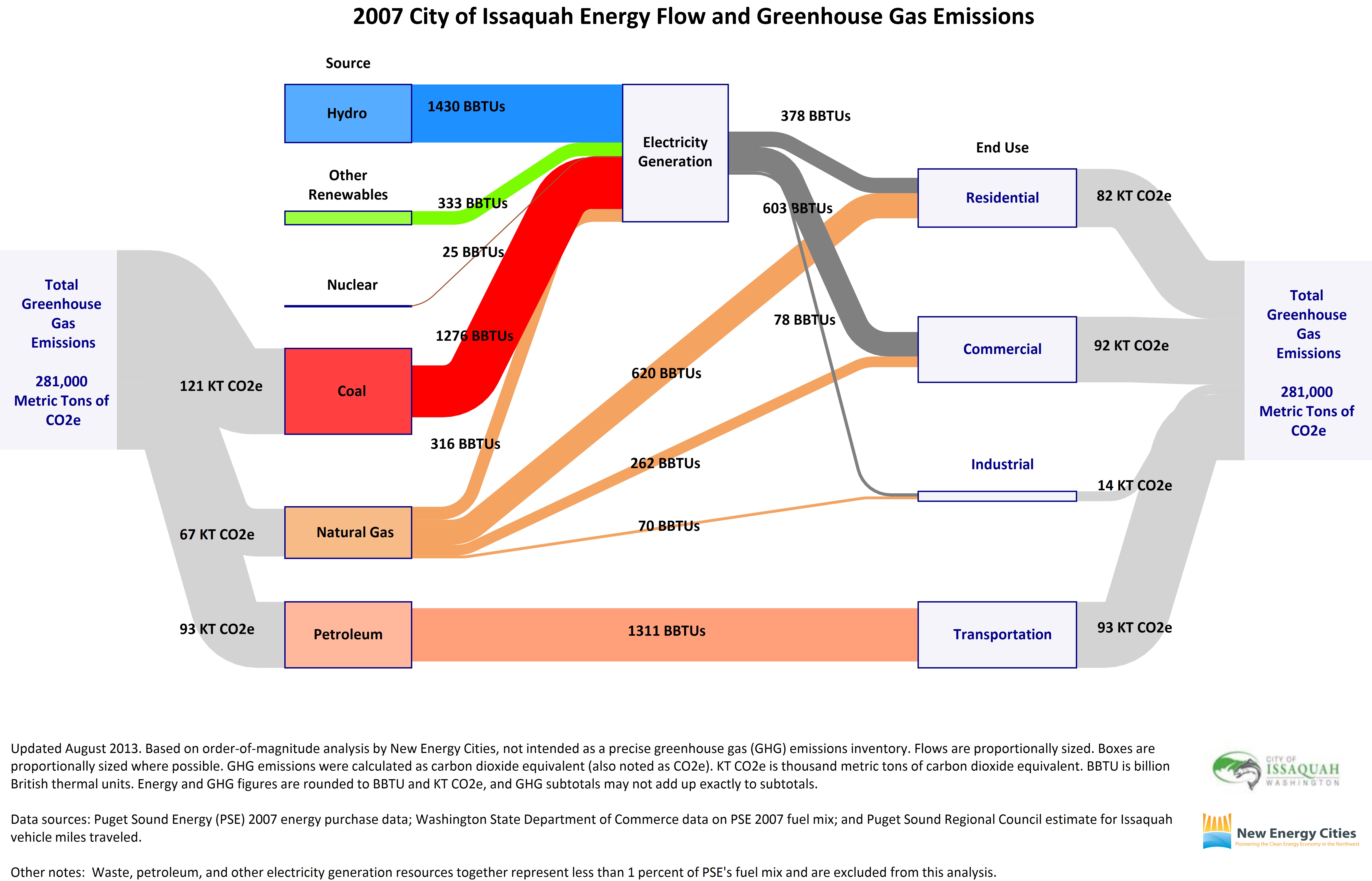
To create Energy Maps for communities, we use a software called e!Sankey that displays energy use and emissions in graphic similar to the US Energy Information Administration’s annual flow charts for the United States.
We like this tool for two reasons. First, it is straightforward to create. We use basic energy purchase data from local electric and natural gas utilities, as well as estimates of vehicle miles traveled from the local metropolitan planning organization. After some basic Excel spreadsheeting, we calculate and plug the energy and carbon values by source and sector into Sankey software that mimics the EIA’s national graphic.
Second, energy use is shown relatively: the boxes and flow lines are proportionally sized to reflect the relative percentages that solar and coal, for example, contribute to electricity generation. Likewise, the graphic makes visually clear how much energy the community’s residential, commercial, industrial, and transportation sectors use compared to one another, and which fuels power them. When we project this on a big screen during a community workshop, community leaders and stakeholders can see in full color which sources and sectors are their greatest liabilities—or priorities— in terms of energy and carbon reduction.
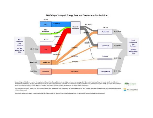
Below is the Energy Map that we created for the City of Issaquah. Total carbon emissions are depicted in the gray flow lines, by both source and end use. The blue flow line represents hydropower energy used for electricity generation; the green represents non-hydropower renewable energy used for electricity generation; the brown represents nuclear energy used for electricity generation; and the red represents coal energy used for electricity generation. The orange flow lines represent natural gas used for electricity generation and direct heating. The pink flow line represents petroleum used for transportation. The dark gray flow lines represent electricity consumption by residential, commercial, and industrial user categories. (See the PDF of this Energy Map here.)
Carbon Wedge Analyses
Once we have calculated and mapped a community’s energy sources and uses and related carbon emissions, we move on to doing a Carbon Wedge analysis, an adaptation of the now-famous graphic that Princeton University’s Carbon Mitigation Initiative pioneered almost ten years ago and Pembina Institute applied in Canada for the Cities of Calgary and Edmonton.
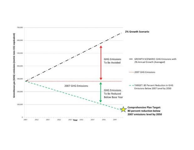
For Issaquah, which has set the goal of reducing its greenhouse gas emissions 80 percent below its 2007 level by 2050, we outlined a growth scenario of carbon emissions out to 2050 (based on projected population growth) on the same graph as its 2007 base level and its targeted 2050 reduction. Visually, the large triangular area between the growth line and the target line represents the emission reductions that the community would need to make in order to meet the target in a scenario of emissions growth.
In the graphic below, we divided the large triangle into two smaller triangles: additional emissions growth beyond the base year ("GHG emissions to be avoided"), and emissions reductions to be made in order to meet the target ("GHG emissions to be reduced below base year"). (The graphic is also linked here.)
We are now working with the City to subdivide these triangles into further wedges or slices, which together represent a prospective work program or carbon reduction pathway for the community in the coming years.
Perhaps the biggest distinction of these graphics is that we portray our findings by order of magnitude—not a ton-by-ton inventory. For cities with limited resources, this work is intended to frame action based on professional local knowledge that city staff and community members already have.
This approach helps city management determine if and where deeper dives into the data are warranted—such as project-level engineering analyses that the city can commission later, once they have a sense of their top carbon reduction priorities.
The bottom line hasn’t changed: the urgency for greening our cities grows even as we lack real carbon limits and funding at the federal and state levels. In today’s financial and political landscape, in order to make informed decisions about whether and how to spend taxpayer money, communities need to use tools that maximize their decision support and minimize their costs and we have found energy mapping and carbon wedge analyses to be critically important.
